Praxis: Click and Drag
A easy-to-use, user-friendly way to move around in a 360° experience
Overview
Praxis Labs is an immersive platform for corporate diversity, equity, and inclusion (DEI) training. It leverages immersive technology, such as virtual reality (VR) and 360° web interactions, and research-backed curriculum to foster workplace empathy and awareness.
The aim of this project was to solve the problem of confusing navigation interaction in the 360° experience.
As the sole designer on the project, I oversaw the end-to-end design process, from user research, prototyping, testing to creating animations and implementing UI elements in Unity.
Client
Praxis
Duration
April, 2022
Roles
UX & Interaction Designer, Prototyper
Tools
Figma, Unity, After Effects

The Problem
Our corporate employee users experience significant difficulties navigating and interacting in the web-based 360° virtual space, leading to confusion and nausea. These challenges result in a high drop-off rate at the beginning of the experience.
To help users effectively engage with the immersive content and reduce the drop-off rate, I need to develop a more intuitive and user-friendly navigation system.
User Research
Qualitative Interviews. I conducted interviews with clients to hear their thoughts on the current mouse-look feature. This is what they said:
“It took me a while to notice a tiny dot in the center of the screen, which I later realized was meant for navigation.”
“It was a bit disorienting, especially when I paused the experience. Upon returning, I struggled to locate the cursor again.”
“It’s a little hard to move around. The mouse is too sensitive.”
Affinity Diagram
Background
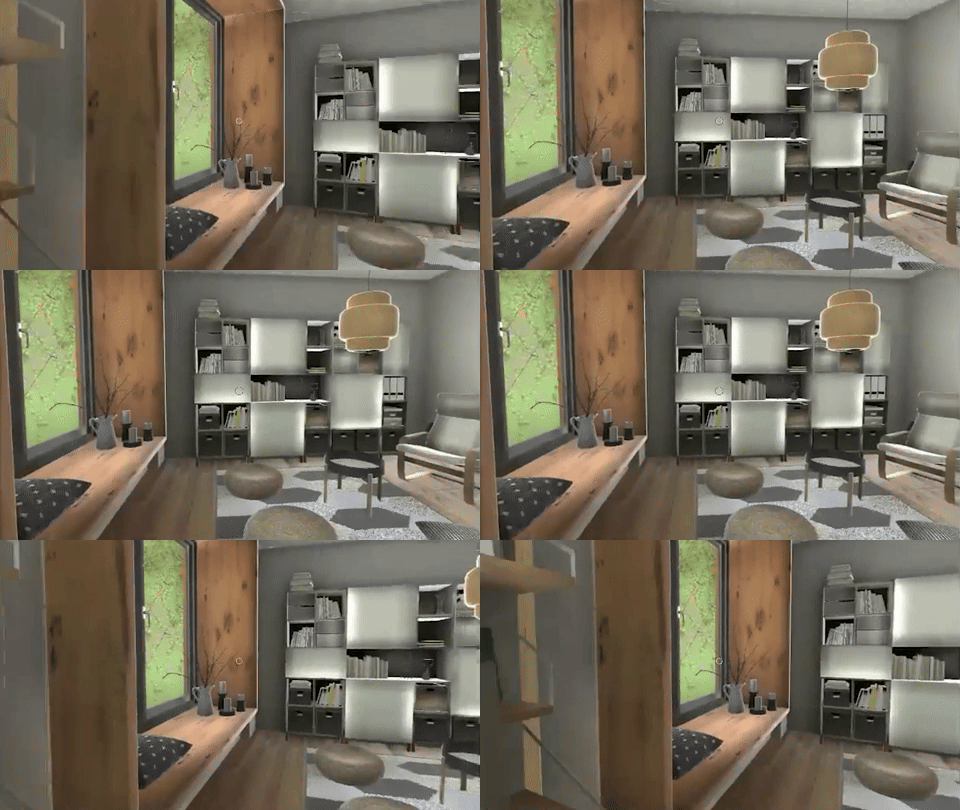
Praxis Labs’ curriculum exists in both web (WebGL) and virtual reality (Quest) formats, with a priority on the web experience. Before I joined Praxis, the company used “mouse-look” to move around in the 360° environment. This approach allows users to move the mouse cursor to change their field of view, mimicking a first-person perspective. However, users struggled to understand and use it effectively, and tutorials were ineffective.
In tackling these challenges, I faced several constraints:
Technical Considerations: The original method required only one set of code for both web and VR, making it easier for the development team. Separating the code required careful planning with the project manager.
Hardware Limitations: The WebGL experience was only accessible on high-performance laptops or computers, limiting accessibility for users with lower-end devices.
Time and Resource Constraints: As the sole XR designer working with a project manager and an engineer, we prioritized reducing the high drop-off rate urgently, with plans to refine the experience later.
Screenshot of the “mouse-look” interaction

Insights
Based on user interviews, contextual inquiry and analyzing the gathered data, I was able to categorize the insights into these 3 categories.
Ideation & Prototyping
Based on user interviews and research, and considering the technical limitations, I generated four ideas to improve navigation using either the mouse or keyboard.
Click and Drag: Adjust the view by left-clicking and holding the mouse button, then dragging to pan.
Edge Panning: Adjust the view by moving the mouse cursor to the edge of the screen.
Directional Buttons: Adjust the view using left, right, up, and down buttons located on the edge of the screen.
WASD Keys: Adjust the view using the W, A, S, and D keys on the keyboard.

Testing
I tested each prototype with 10 people recruited on usertesting.com to determine which navigation method users preferred. The following section presents the results and insights gathered from user feedback.
Click and Drag and Directional Buttons both scored high on all dimensions; however, the presence of other interactive elements makes directional buttons distracting and lessens the immersive experience. Therefore, I decided to go with Click and Drag.
New Onboarding
The old design had a lengthy, one-time tutorial to walk users through how to use “mouse-look,” guided by a virtual docent, Maya. However, there are three problems with this method:
Time-consuming
Difficult to remember
Lacks repetition for easy recall
In the new design, I designed a recurring visual tutorial at the beginning of each module. This method ensures first-time users can quickly grasp the navigation mechanism and returning users can recall it effortlessly.
Users need to finish the tutorial to start the learning experience.
Sketches of the onboarding UI tutorial
The Solution
The Click and Drag navigation method simplify user interaction within the 360° virtual space.
This design reduces discomfort and enhances user engagement by optimizing the cursor movement range.

Animation
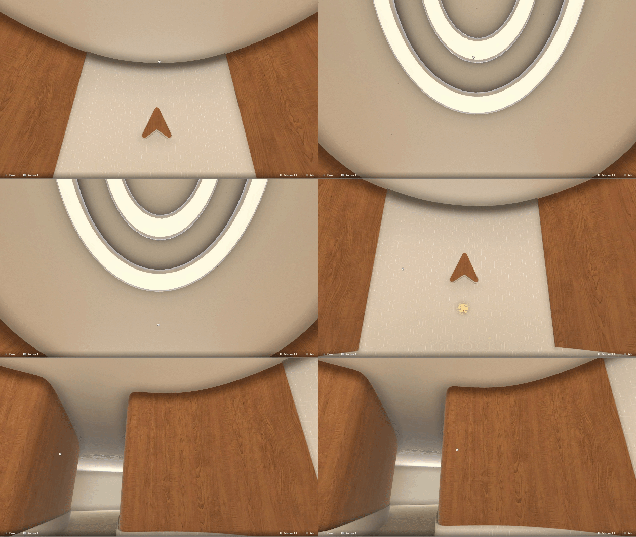
With the animated icon, users receive clear guidance on navigating their experience. The highlighted mouse icon instructs users to left-click, ensuring interactions are intuitive and straightforward.
Cursor States
I designed idle, click-and-drag, and hover states to provide visual feedback for user interactions and accommodate other actions like clicking buttons.
180° Capping
The cursor movement range is capped at 180 degrees on both X and Y axes since the main area of interest is directly in front and decreases with increased head movement.
Results
Since implementing the new Click and Drag navigation, we have observed a significant decrease in the drop-off rate. Users have provided positive feedback on the simplified method for adjusting views and the accompanying guidance, which has helped them acclimate more easily.
Before
After
Takeaways
Gather Early and Continuous Feedback. Testing multiple prototypes allowed me to iterate quickly and efficiently. This approach proved invaluable in refining the navigation methods and ensuring they met user needs.
Immersion and time on task. While the prototype with Directional Keys scored the highest, I chose Click and Drag as the final option. It provides better immersion and eliminates the need for users to move to the edge of the screen to click buttons, thereby saving time and enhancing the overall experience.
Future Improvements: Accessibility. Enhancing accessibility by potentially allowing users to customize their cursor sensitivity could help reduce the chance of motion sickness. In the future, exploring this feature alongside alternative navigation methods like WASD keys or directional buttons could potentially improve the overall user experience.


