Praxis: VR Interaction Overhaul
Redesign virtual reality user interfaces and interactions to enhance usability
tl;dr
Praxis Labs is an immersive platform for corporate diversity, equity, and inclusion (DEI) training. As the sole UX designer, I tackled the challenge of improving the VR user experience, which was initially plagued by inconsistent visuals, confusing navigation, and unfamiliar interactions. Through user research and iterative design, I addressed key usability issues, leading to smoother navigation and a more satisfying user experience.
This user-centered approach not only enhanced usability and reduced frustration but also set a new standard for future VR design projects at the company.
Client
Praxis
Duration
Sept. - Nov. 2022
Roles
UX/UI Designer, Prototyper
Tools
Figma, Unity, ShapesXR

The Problem
Our office worker users need an intuitive and seamless experience within Praxis’s VR platform. Currently, the unconventional UI design and lack of guidance often result in users getting stuck, leading to confusion, frustration, and ultimately abandoning the experience before completion.
Our goal is to design a solution that helps users become familiar and comfortable with VR, ensuring they feel inspired, informed, and satisfied throughout their journey.
Heuristic Evaluation
I led a heuristic evaluation with the stakeholders, comparing the current design against Jakob Nielsen’s 10 usability heuristics, I used the results to highlight three areas that needed the most attention:
Consistency and Standards
Match between system and the real world
Aesthetic and minimalist design
Usability Testing
With the help of the customer success team, we conducted in-person testing sessions and qualitative interviews with 20+ users, where they were asked to complete a short intro module.
“I felt frustrated when I couldn’t figure out how to use the platform (VR). It made me want to give up.”

Insights
Following extensive user interviews, contextual inquiries, and data analysis, I grouped the insights into four key categories.
Spatial Design
Design Constraints
Before I started the project, I aligned with engineers and project managers to understand the scope and expectations. The constraints helped me better manage expectations.
Hand Tracking: The interaction was pre-determined to be achieved through hand-tracking, not controllers, which limited design options and required careful consideration of gesture recognition.
Time Constraints: Limited time for deeper research restricted the ability to conduct extensive user testing and gather comprehensive feedback.
No Design System: There was no established design system in place, necessitating the creation of a cohesive UI while ensuring consistency across various elements and interactions.
Spatial Layout: Anchored vs. Following
A major design decision was whether the interface should follow the user’s head movement or stay anchored in the space. Both approaches have their own pros and cons, so I decided to test them early with users.
The UI is anchored statically in the space
The UI follows user's head movement
Testing revealed that users prefer the anchored interface, as they are less likely to feel nauseous and appreciate that their vision isn’t constantly obstructed by user interfaces, which was a common issue with the following method.
Wireframe & Prototyping
I created low-fidelity wireframes for the primary use cases and, after receiving approval from the product manager, developers, and stakeholders, began prototyping in ShapesXR.
Style Guide
My process for creating the style guide began with understanding the specific needs and constraints of the VR environment. I collaborated with engineers and stakeholders to define clear guidelines for UI placement, hand tracking gestures, and user interaction zones to ensure comfort and usability. Through iterative design, I established consistent principles for visual elements like color, typography, and spatial organization.

Solutions
Consistent and standardized UI
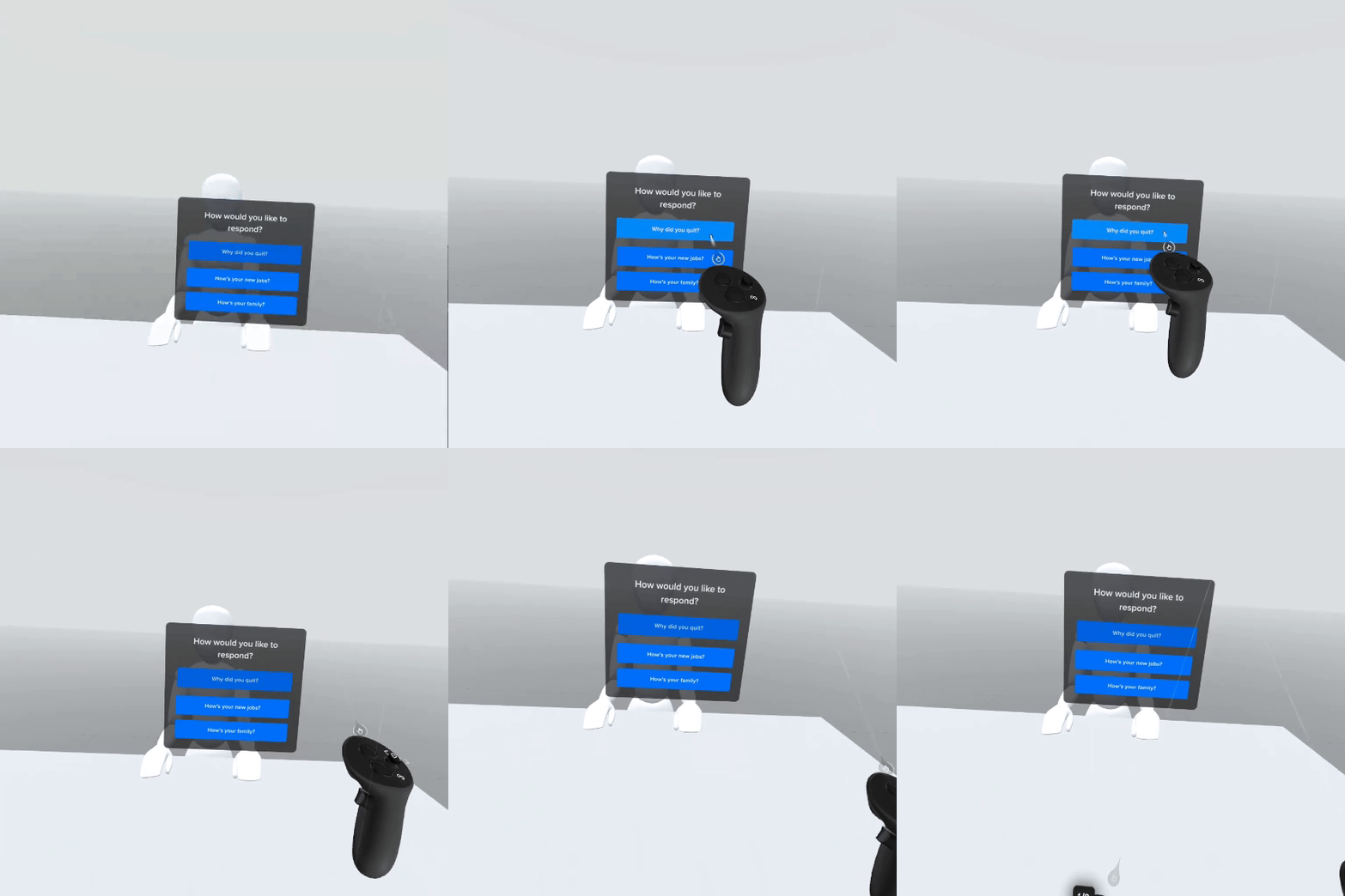
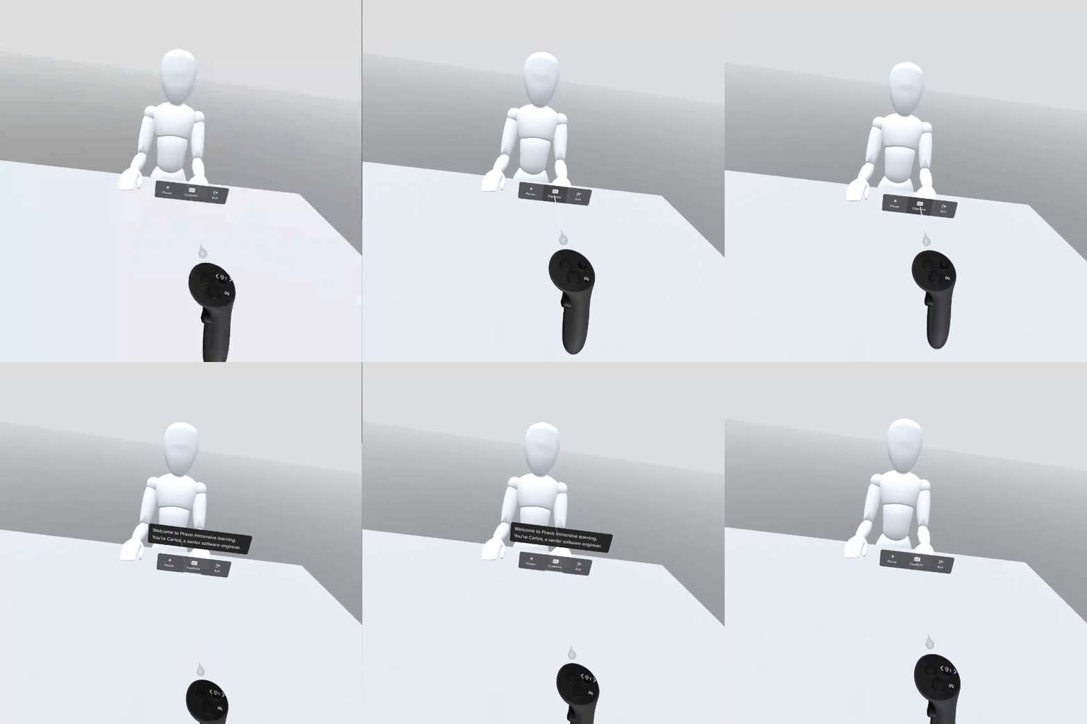
Before: Inconsistent design, unconventional elements, and unpredictable layouts made navigation confusing and disjointed, resulting in user frustration and poor usability.
After: I applied design standards to unify the visual style and adopted conventional interfaces familiar to users, creating a more intuitive and cohesive experience.
Acclimate users with unfamiliar interactions
Before: Unfamiliar interactions, like asking users to read prompts out loud, were introduced without giving users opportunities to practice.
After: I added a tutorial to help users get familiar with complex interactions. Users can now practice the Speak Out Loud function, ensuring they aren’t caught off guard when encountering it later.
Complete Experience At Users Own Pace
Before: No options for users to save progress and come back to finish the experience later. They have to sit through the 30-40 minute experiences in one sitting.
After: I designed a resume function for them to save process and pick up where they left off previously.
Takeaways
Leading the redesign of Praxis Labs' virtual reality (VR) user interactions was a challenging yet rewarding experience. Through extensive research, I learned the importance of a user-centered approach, as real user feedback directly informed our design decisions. Here are a few takeaways:
Embrace 3D Design Elements: Designing for VR requires consideration of spatial relationships and depth perception, which are critical for creating intuitive interactions beyond traditional 2D interfaces.
Navigate Design Constraints Effectively: Working within constraints—such as the predetermined use of hand-tracking and the absence of a design system—requires innovative solutions to maintain a cohesive user experience.
Leverage New Prototyping Tools: Utilizing tools like ShapesXR for prototyping allowed for rapid iterations and effective visualization of interactions in a 3D space, enhancing collaboration and user testing.


